Versy 2.0
Android & iOS app
July - November 2015
Role - Senior Designer
Client - Myriad
Agency - Head London
Design Director - Andy Bennett
Director of Strategy and UX - Lola Oyelayo
UX Designer - Nick Reynolds
Links: App Store, Google Play
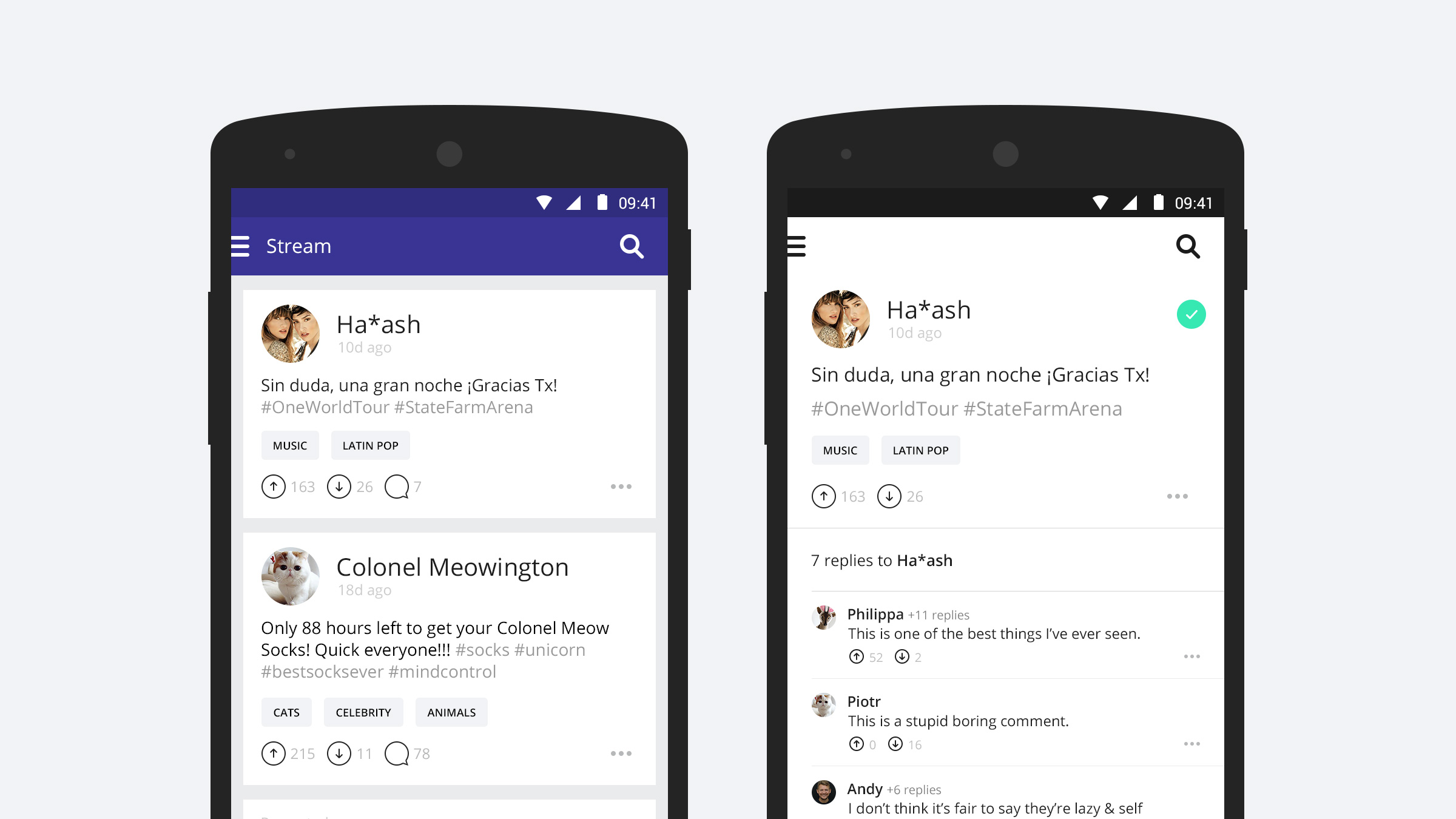
In July 2015 I started work on Versy 2.0 for Android and iOS. Following the rebranding from msngr to Versy, the next step in the product life cycle was a move towards content discovery and social discussion, while still offering enhanced chat capabilities including one-to-one and group chat.
msngr was one of the largest chat platforms in South America and had millions of users with tens of millions of messages being sent on a daily basis. As part of an agile team, the challenge was to pivot the product from a closed group and 1-to-1 messaging platform to a content discovery platform which enabled users to discover new content based around their interests and have public or private conversations about it.
Discovery
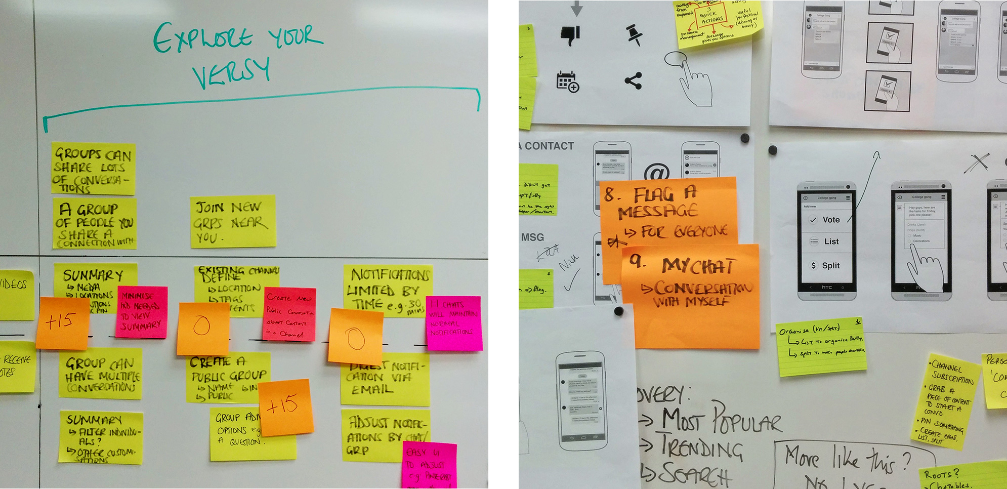
To start with, Head ran a five-day Field Studio in Austin, Texas where they carried out a Culture Hunt and Ethnography sessions. These were followed by co-creation sessions and finally a Zoom Out workshop. The output informed a high level product strategy and provided epics for the product backlog over the next 8 sprints.
One of the insights was how group chats on the existing platform would grow to 4000+ people and that these “super groups” were being used by people to chat about things they shared a common interest with. However these conversations were fragmented and hard to follow due to the large number of people in the group, all talking about different things.
We developed the idea of the "Versy universe" - a space where you can follow channels / feeds you were interested in and chat about common interests with like minded people. Anyone can post their point of view or share content to their channel - and each post or reply to a post could become the trigger for an entirely new conversation thread. We observed how on Facebook, the number of replies to a reply is limited to 2 levels, and after 2 replies you have to have to continue the conversation on the parent level. We wanted to explore the value of having an infinite number of replies to a reply therefore making conversations easier to follow.
The conversation flow
Prototypes
I prototyped a number of interactions to explore how a user would navigate down infinite conversation levels and replies, and then navigate back up the conversation tree. Encouraging users to get lost down a rabbit hole of content by creating a serendipitous organic browsing experience was key to the concept.
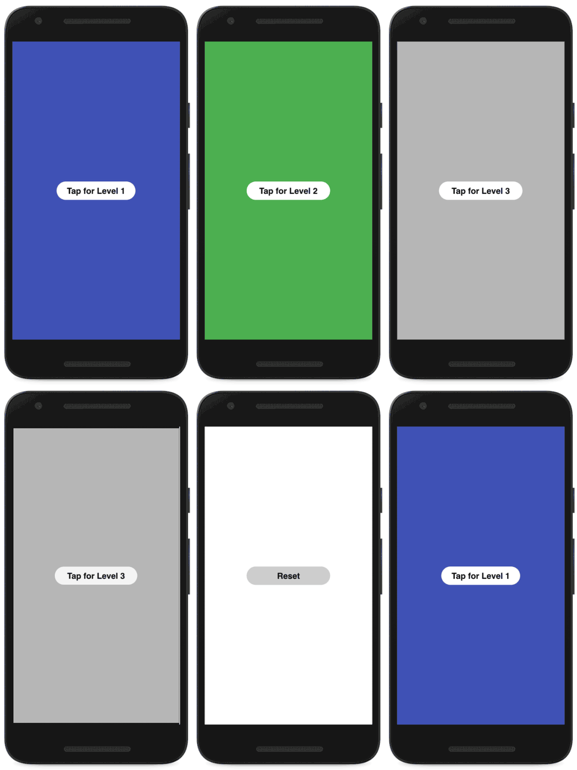

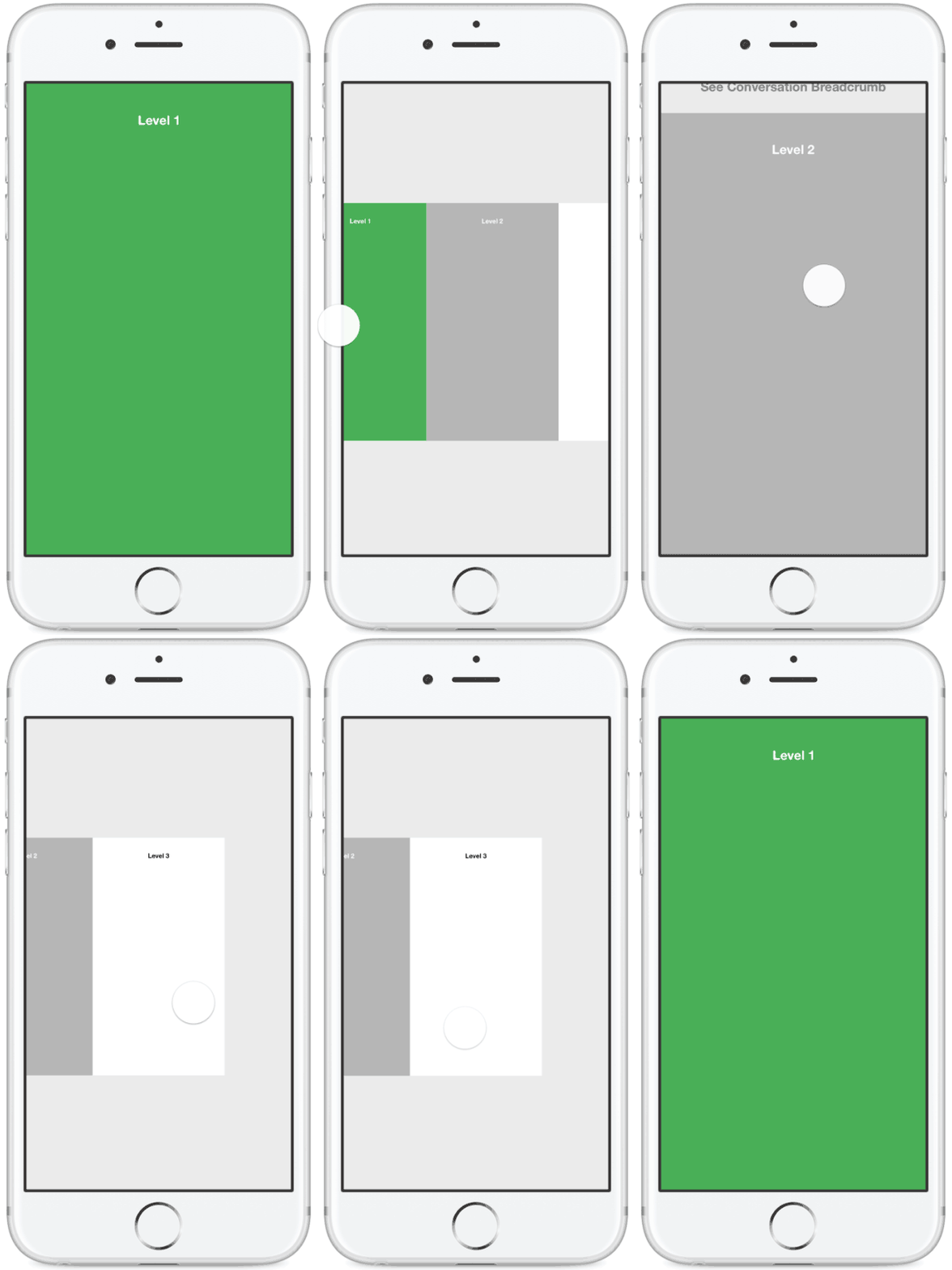
Drilling down conversation levels and navigating back up the tree
Working with a remote dev team not quite used to the agile way of working, we experienced some challenges around quick releases and communication of ideas. Being able to prototype and share interactions proved super handy in articulating our thoughts better as well as get feedback around technical feasibility.

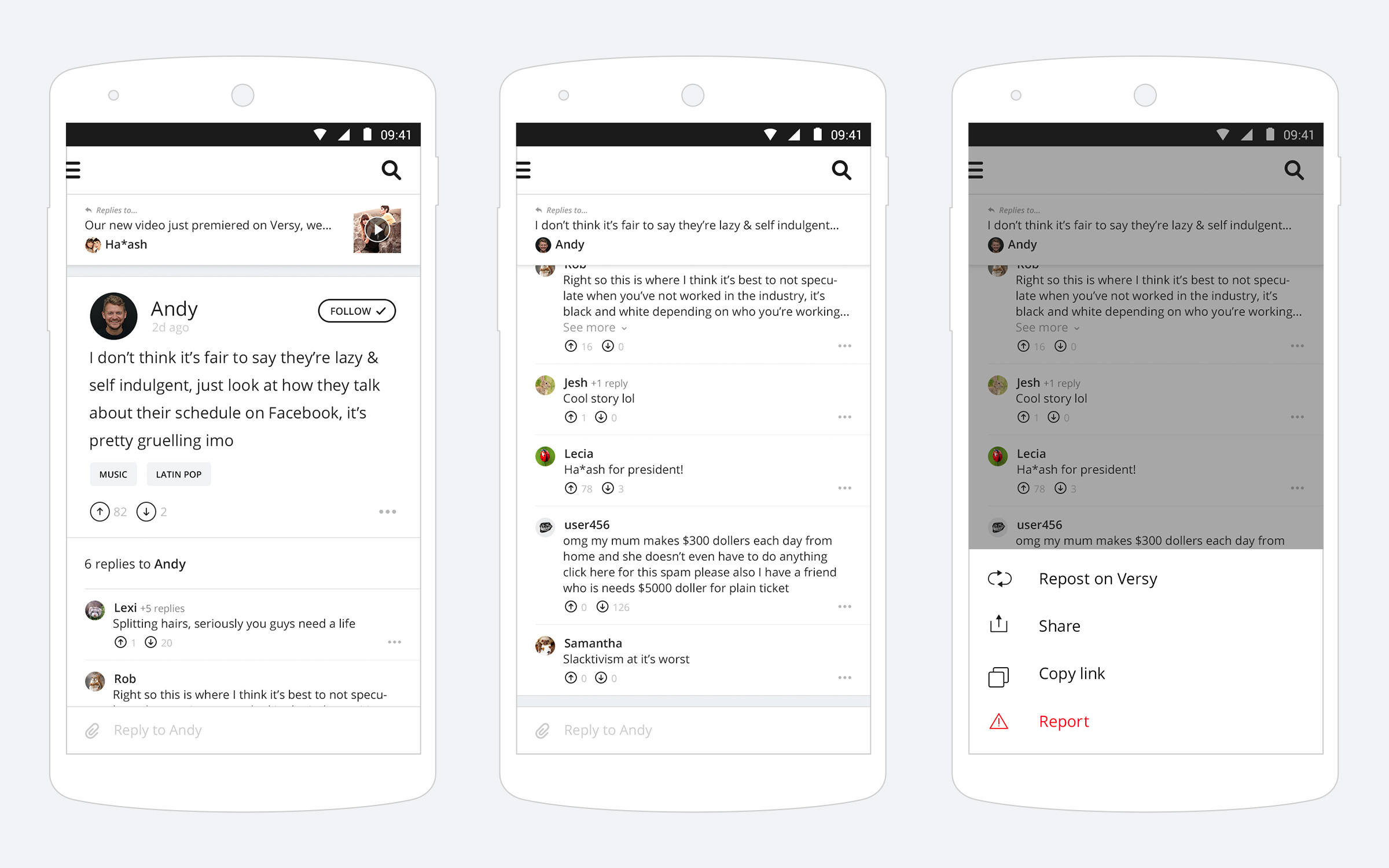
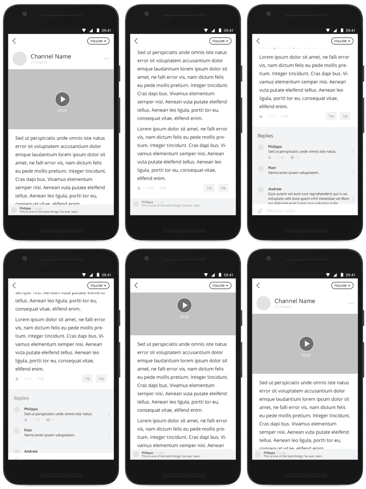

Comment Activty Bar and Context Bar
Design
As branding and hi-fidelity design were not part of the scope, we focused our efforts on developing the UX alongside a non-branded interface that could be rapidly tested and built. I worked closely with Nick creating wireframes, animation prototypes and higher-fidelity designs where needed, keeping in mind the different patterns across both Android & iOS.
Nexus 5 xhdpi vs iPhone 4s Retina
Output
In December 2015 Myriad took the design & UX in-house with an MVP launched on the App Store, Google Play and for Responsive Web at the beginning of 2016.
Some of the ui elements designed for the MVP
